Callym Lukie | Level Designer

Iron Reef
This map is a collaboration between myself and Liam Brennan. Together we are designing a Call of Duty inspired battle royale map. For every decision made, COD's many mechanics, cameras, and features are taken into careful consideration.
It began with planning out an abandoned military base. This map would feature 6 unique points of interest [POI]. 3 built by myself, 3 built by Liam. The transition spaces between were to also be designed to tie the whole island together, and make a realistic, art ready map.
TOP VIEW

Transition (ORANGE)
Spaces between POI's that make entering POI's easy. They offer the same amount of tactical gameplay, but are lower on the loot side of things. Good spaces for new players to land without a contested fight.
POI's (RED)
Main locations spread across the map. Best places for good loot, fighting opponents, and getting your load out. Tons of resources for those willing to fight for it.
The Points of Interest
Overall Project Images
- Structured Geometry
or Terrain
- Placeholder Art assets (to be replaced by art team)
- Zip Lines
- Water


Command Center

Command Center

Dock Yard

Living Quarters

Command Center
POI Trailer Video
TOP VIEW

Intent with the Space
-
Create a large overall area that feels intimate with its intricate spaces.
-
The threat of a third party is always high, I want to make sure players have multiple quick escapes.
-
I wanted various ways to access each floor allowing players the opportunity to outplay their opponents, and showcase their map knowledge.
-
The exterior locations are designed as standalone maps that offer the same competitive feel any map would.
-
I wanted the Command Center to be a place newer players can land without being under immediate threat.
Initial 2D Layout

- Ground Floor
- Floor 2
- Floor 3
- Roof
- Cover
- Solid Walls
- Staircase
- Zipline
- Ramp / Vault (Up or Down)
Approach
The initial stages began with the following:
-
Gathering online references for central command buildings.
-
Noting initial design goals, and over all plan for the gameplay
-
Studying what makes central command buildings a powerful space, and incorporating that into gameplay.

Creating and Separating Intimate Combat Spaces

ORANGE
Assets that break up sightlines to create two rooms inside of one interior area.
R/G
The two isolated rooms
A Player View
Before

ORANGE
Assets that break up sightlines to create two rooms inside of one interior area.
After

GREEN
The visible area within the players sightlines
Notes
The Command Center is a big area. I wanted to create intimate combat by making small arenas within the POI for players to fight.
I did this by:
-
Breaking up long sightlines into smaller compact areas
-
Developing arenas within larger structures that
-
Unique fights with many angles and entrances
-
Opportunities to use map knowledge to your advantage in combat
Blocking Long Sightlines

ORANGE
Assets that break up sightlines to create two rooms inside of one interior area.
G/R/B
The sections that are isolated from combat outside this area.
A Player View
Before

ORANGE
Assets that break up sightlines to create multiple rooms that are individual from each other in this single section.
After

GREEN
The visible area within the players sightlines that immediatly grabs the players attention.
Notes
Long open sightlines in intimate spaces catch the players attention in ways I don't want it to.
-
Attention shifts from what is immediately important, to what is far away and not threatening.
-
Players feel like they are jump scared by surprise encounters whether that is from close, or far away.
-
Long range third parties are limited due to the provided cover.
-
Multiple fights can break out within meters of each other without interference from nearby players.
Iterating on Beneficial Sub Arenas
Before

After

Notes
The original close quarters section left much to be desired. It wasn't benefiting gameplay because it was forcing close quarters combat in an area that didn't need that.
Replacing it with a helipad added elevation, created a unique basement combat area, and gave overhead protection from opponents playing on top of nearby buildings
Multiple Escape Routes

RED
The immediate, available escape paths for players.

GREEN
The small arena in which the player is leaving.
A Player View


Notes
The small arenas also benefit players who are looking to escape a fight. Whether the reason is lack of heals, ammo, or just out skilled.
-
Destruction, cover, and accessible elevation offer multiple ways for player to lose their pursuer.
-
Escapes can quickly switch to ambushes for those pursueing.
-
Clutter is placed to allow players to swiftly traverse spaces.
-
Quick escapes allow players to prepare safely for a future reingage.
Development Overtime

1

3


4
2
Challenges and How I Overcame Them
My main challenge was breaking up long sightlines, and opening spaces to condense gameplay without removing key geometry.
I managed to overcome this challenge by doing the following.
-
Instead of using multiple assets, i instead used one piece that served a purpose from all 360 degrees around it.
-
The same shipping container provides value from all 360 degrees, as well as breaks up sight between two sub-arenas.
-
I introduced chain fences that players can shoot through, but cant see through. These break up the players view, but don't impede gameplay opportunities.
-
I designed each room, and exterior space by imagining sub-levels players would fight in, and creating those spaces to optimize gameplay.
-
My tactics to solving this problem all turned me into a more critical thinking when it comes to placing down assets in a level. I began thinking more about the benefit each piece would bring, and experimented more with alternative locations, and angles before making a final decision.
Another challenge I faced was building with too many square's, and square-like shapes which I fixed by doing the following.
-
Removing corners to create different angles.
-
Using hexagons, L shapes, and other unique pieces to diversify the space.
-
Placing large boxes alongside long walls that force movement, and break sight.

Dock Yard
POI Trailer Video
TOP VIEW
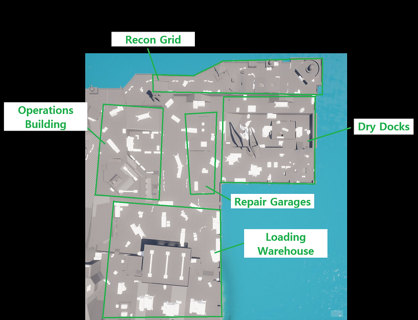
Intent with the Space
-
Large space with long angles to support long distance gun fights.
-
Allow this with close range weapons to zip zag through cover to close the distance between a long range opponent.
-
Design buildings that have unique geometric shapes to practice using more than squares and rectangles.
-
Bring in elevation through a lowered dock, a raised scouting platform, and other warehouses.
Initial 2D Layout

- Lowest Level
- Level 2
- Level 3
- Highest Level
- Cover
- Solid Walls
- Staircase
- Zipline
- Ramp / Vault (Up or Down)
- Water
Approach
The initial stages began with the following:
-
Understanding how to make tactical clutter as dock yards are full of debris.
-
Noting initial design goals, and over all plan for the gameplay.
-
Reference gathering on how dock yards operate to include those elements in gameplay.

Balancing Long Angles
DARK RED
GREEN
The long line of sight this space was designed around.
The available cover players can use to close the distance on far away opponents.

A Player View
Angle 1 (left side)

Angle 2 (right side)

Showcasing the sightline from an in game player perspective.
GREEN
The cover players can use to close the distance from a players perspective
RED X
An example player sitting on the other side of the sightline.
Notes
This is how I balanced the effectiveness of long angles, and the opportunity to close the distance.
-
Created interior, and exterior spaces for players to approach far distances.
-
Built lots of half and full cover to protect players from attack.
-
Zig-zagged cover to allow those at longer ranges the ability to attack players out of cover.
-
Designed places players could alter their anchor point to take another angle.
Communicating Clear Intentions
Before

RED
A confusing flat platform that looks like players could access it.
After

GREEN
The slanted roof that obviously can't be walked on.
Notes
While developing levels it is important to make sure your intentions are clear. Here I built a section that initially looked like it was playable space, but my intention was for players to not access it.
By slanting the platform I was able to easily communicate this space wasn't meant for players to sit on.
Balancing Combat Between Long and Short Ranges

ORANGE
The cover that allows players to slowly close the distance between them, and their opponent.
GREEN
The playable long angle space.
A Player View
Before

GREEN
The most prominent visible space to the player.
After
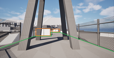
ORANGE
Assets that allow players to slowly close the distance, but still make the angle contestable at a long range.
Notes
Sightlines in the Dock Yard are meant to be playable at a long range, but I also want those with short range weapons to be able to slowly close the distance between themselves, and their long range opponent.
-
Most cover is placed at half height to ensure players can still shoot over top of it.
-
Assets are placed with enough distance between each section in order to allow players to waterfall down towards their enemy.
Unique Geometric Buildings

RED
The exterior shape of the building.

GREEN
The interior shape of various room
Notes
Rectangles are easy to build with, but they create too much repetition in gameplay. Here are some reasons I changed my structures up.
-
Unique interior rooms allowed me to design angles that were specific to each building.
-
Gameplay was unique to all other buildings on the map.
-
Players were pushed out of their comfort zones, and forced to adapt to a new environment.
-
Clutter is placed to allow players to swiftly traverse spaces.
-
These buildings bring identity to the Dock Yard POI.
Promoting Decision Making in Gameplay
North to South View
Before

1
After

1
South to North View
Before

2
After

2
Notes
The initial space plays like a time to kill race. Players have no good cover, and must compete to see who has the faster time to kill on the other.
The improved encounter offers cover that mixes half and full height that juts out into the space for a tactical encounter. This forces players to make quick decisions of when to peak, where to move, and how to outplay their opponent.
Various Elevation Opportunities


Notes
Dock Yards are usually designed flat. These images showcase how I designed the environment to promote elevated gameplay.
-
Making roofs accessible through mantling stacked boxes, and other movement mechanics.
-
Creating multiple points on the same elevation.
-
Using large assets in places that give players an opportunity to challenge those on high ground with near equal footing.
-
I made sure high ground wasn't overly powerful ensuring optimal high ground locations had weaknesses in the form of other high ground spots in direct contention, or creating openings for enemy fire.
Water Exit Points


Notes
I don't want to persuade people into jumping overboard into the water, but it is still something I have accounted for in my design. Small ladders leading to platforms give players the opportunity to easily access the POI if they accidently (or tactically) fell into the water.
POI Identity and Landmarks


Notes
The Dock Yard is on flat ground below most other elevated POI's. I needed to give it an easily identifiable piece that served as a landmark to the Dock Yard.
-
The large crane is visible from most points on the map when you are looking at the dock yard.
-
The crane is an easy connection to the docks.
-
The landmark also serves as a vantage point within the poi as it is playable space.
Development Overtime

1

3

2

4
Challenges and How I Overcame Them
My main challenge was maintaining long angles while adding in cover for players to close the distance.
I managed to overcome this challenge by doing the following.
-
Varying the height of cover by using half cover, full cover, and thin and thick pillar style cover.
-
Placing assets pieces on the sides of the players view. This allows them to move both forward, and side to side so a pursuer can dodge shots while moving into cover, and the long range opponent still has the opportunity to line up a shot.
-
Instead of just adding cover. I would also add larger buildings allowing players to trip up their long range attacker, and emerge from an unexpected area. This created the option for a tactical outplay on your opponent instead of just a zig zagging approach.
It is super easy to over clutter an area. While gathering references for the Docks in particular I came across tons of images where the entire space was super cluttered. To avoid cluttering my space, I learned how to do the squint test when adding cover, and other assets to my spaces.
By looking at a reference image and squinting my eyes I'm able to see the pieces of geometry that stand out the most. Those are the items I then tactically place to promote good player decisions, reduce confusion, and keep the area clean so my design doesn't impede player movement.

Living Quarters
TOP VIEW

Intent with the Space
-
A close quarters location with a multitude of possible attack angles.
-
Create multiple ways to access vertical, and horizontal pathways.
-
Reward players who frequent the location, and learn its many routes to ambush unexpecting opponents.
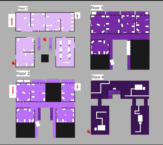
- Ground Floor
- Floor 2
- Floor 3
- Roof
- Cover
- Solid Walls
- Staircase
- Zipline
- Ramp / Vault (Up or Down)
Initial 2D Layout
Approach
The initial stages began with the following:
-
Gathering online references from military living quarters.
-
Initial design preparations with the intended gameplay experience.
-
Figuring out how to gamify the realism of a living quarters space.


Notes
Destruction allowed me to create movement flow in places that doorways, or other openings wouldn't make sense. The destruction connects multiple areas together into one large encounter space.
This allows for:
-
Ease of movement through spaces
-
Quick escapes from losing fights
-
Unique fights with many angles and entrances
-
Opportunities to use map knowledge to your advantage in combat
Unique Rooms


Notes
Living spaces are repetitive. part of my initial design was to create unique spaces that allowed for gameplay to break out differently in each room.
-
Large pieces of geometry create various angles, and places of cover for players.
-
Gameplay is different in each room forcing player to be constantly thinking about their surroundings.
-
Room are different sizes makes some fights closer range than others.
-
Players can use their knowledge of each rooms to gain advantages in combat.
Easily Traversable Rooms


Notes
Cluttering rooms creates difficult gameplay for those who are trying to quicky run through a space.
-
Keeping cover towards the center of the room, or along the walls to create easy paths for players.
-
Block players camping tight sight lines by giving cover to those entering.
-
The level doesn't interfere with combat, the two work together to create a tactical encounter.
-
Players can stop and take cover in any room switching a fights advantage.
Guard Tower Re-Design


Notes
The guard towers were meant to be a playable space where players could get a high ground advantage, at the cost of limited space.
Initially, the guard tower was way too tight. Players were not comfortable standing on top, and circling around such a large base.
My second iteration opened up the middle to allow players to access the whole space at once. But the pillars ended up being an easy way to take cover from fire, explosives, and other counter attacks.
The third iteration opened the entire base up, but closed off the middle section. The pillars were now usable for cover, but if a player were to sneak up behind someone they would have free shots at the campers back.
Vertical Accessibility

Before

Limited options that are slow and put the players in a weird situation.
After

Increased accessibility to height through easier to use pathways, and multiple options.
Notes
3 floors is a lot to climb without some assistance. This space has multiple ziplines, staircases, ladders, and mantle points scattered around the building to access height.
-
Easily access to height means a constantly changing battlefield where players aren't restricted to one elevation.
-
Accessible height is easy to find making it a common part of encounters instead of a luxury.
-
Combat isn't restricted to a horizontal direction, instead players can engage with others on varied elevation.
-
Height is no longer a deciding factor in combat because players can access it everywhere.
Exterior Sub-Arenas


How I Intend the Arenas to be Used
Notes
I wanted the spaces surrounding the Living Quarters to stand alone as tactical, cohesive encounter spaces for players to fight.
-
Designed to work as an arena for players to fight around and inside.
-
The spaces have cover around the edges that contain a fight inside the space minimizing (not removing) third party interference.
-
Easy transition space to access the main POI without being in no mans land.
-
Allows players to land outside the POI, loot up, and then pick a fight inside.
Destruction
Development Overtime

1

3

2

4
Challenges and How I Overcame Them
Althought it was my initial intention to create unique gameplay in each room, it was tricky because of a few reasons.
-
Each space will be made up of the same assets.
-
Rooms were all shaped similarly.
I believe I solved these issues by improving, and frequently introducing these key aspects.
-
Altering the playable shape of each room by creating unique shapes with large pieces of geometry.
-
Opening up walls so players gained access to the outside or adjacent rooms.
-
Connecting exterior balconies for quick transitions between spaces.
The space began to feel cluttered which hindered the intended fast paced movement. I fixed this by doing the following:
-
Introducing pillars that gave good cover, and took up minimal space.
-
Stationed more assets beside walls to fix flow, and stop corner camping.
-
Altered the rooms shape instead of introducing more assets.
The result of these changes were the following:
-
An easier to read space.
-
More time could be spent shooting and planning instead of dodging the world around you.
-
The rooms chained together for quick movement, and multiple outplay opportunities.
Examples of My Design Intetions
Iterations and the Why
A quick dive into my thoughts when making iterations, and choosing them.
#1

Sight lines from one end of the dry dock to the other were way too long, creating un balanced gamepaly.
While squinting and looking, this space blended into one.

The ship hull introduced a sight blocker, additional gameplay, and interesting elevation.
The hull also divided gameplay into identifiable sections.
#2


The players view is too strong. They can see through the entire building, and out the other side.
This is too strong due to so much information being available in one single spot.

Altering the doorway and window positions allowed me to force player to be moving in order to gather the information on their surroundings.
A timelapse of the entire above process
Paper to Engine Design
A quick look at how I bring design from a paper concept, to an in engine version.
Step 1 - Rough 2D Sketches


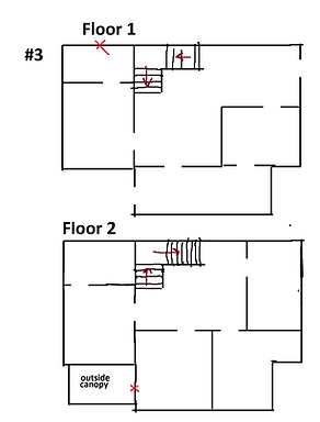
3 quick 2D layouts made to get a base idea of how I wanted to develop this building in one of my POI's.
I made each one different enough to where they would all result in different gameplay situations.
Step 2 - 2D Layouts

The process then went to me picking 2 of the layouts to develop in more detail. I solidified angles, rooms, transition spaces, stairs, entrances and exits.
Step 3 - 3D Blockout


Weighing the options in each layout, I picked one that I wanted to fully develop in the space and turned it into a 3D block out.


Design Process on a Single Space
A quick look at 6 iterations in my design process overtime to fully develop a certain section.
Iteration 1

Initial Observations
-
The area is flat with no real decision making, or opportunity for unique gunplay and movement.
-
Only one real access point that restricts gameplay to one singular spot.
Next Step
-
Open the space up to create more tactical decision making.
Iteration 2

Iterations
-
More accessible with multiple pathways that snake their way up the hill side.
-
Different elevations create unique encounters.
-
Removed the large roadway as it didn't benefit the area.
Next Step
-
Create some depth as every path leads to the same access point.
Iteration 3

Iterations
-
Created more angles, cover, and opportunities by extending only half the upper platform.
-
Wrapped a path around the back of the foundation for an alternative entrance.
Next Steps
-
Reduce the power of the upper deck as one the player has vision everywhere.
-
Add an entry on the right side.
Iteration 4

Iterations
-
Added a raised walkway to access for more right side gameplay.
-
Railing gives extra cover to those above and below due to the reduced angle.
-
Added a staircase to access the right side point from the road.
Next Steps
-
The foundation needs an easy way to enter without needing to mantle.
-
Some tight spaces should be widened for ease of use.
Iteration 5

Iterations
-
Widened the pathway that gives access to the wrapped walkway on the right side.
-
Added a small staircase that creates cover, and east access.
-
A hill positioned parallel to the pathway allows longer range fights on the same level ground.
Next Step
-
Make the cliffs easily identifiable.
-
Clean up ramps, and ensure everything is easily accessed.
Iteration 6

Final Touches
-
Added rocks to easily identify cliffs.
-
Made right side wall flush with the foundation so mantling is easier.
-
Moved the tower to close off a long angle into a nearby POI.
Gif of Each Milestone
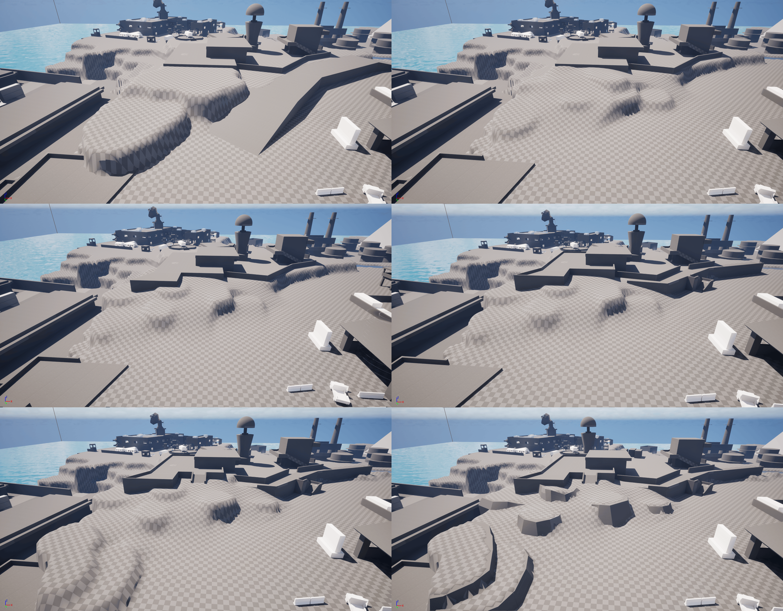
Simple, but Important Battle Royale Design Techniques
A few designs that go under the radar when observing the Battle Royale map. Here I explain why they are used, and what benefit they serve.
Box Stacks
COD has 2 very important movement mechanics. Mantling, and Wall Jumping.
These boxes are often stacked beside walls to allow players to either mantle, or wall jump to a higher area.


BLUE
The path to Mantle each box.
RED
The path to Wall Jump off the taller box.
Staircase Clutter
Staircases can be places players like to hide, but if not carefully monitored players can get stuck in an uncomfortable position.
Cluttering the bottom is important so the player isn't forced into a crawl while moving towards the bottom of the staircase from underneath.


Roof and Railing Ledges
Railings protect players sitting on top of buildings from enemy fire, and falling off.
The thickness is also intentional to allow players to stand on top of the railings for an alternative angle, or a better view at players below.

